Types Of Controls In Acumatica
Hello everybody,
today I want to describe with some screenshots kind of controls that you can get from Acumatica developer like me or any other Acumatica programmer.
Main purpose of this blog post is the following. Imagine, that you want to write super detailed instructions for Acumatica developers. After reading this article I suppose you'll be able to write instructions to them with any kind of detalization. Or even super detailed.
First of all, I want to point that as usually Acumatica pages consists of two parts: top and bottom. Top part often is named summary, and bottom is considered to be detalization of top. Take a look at following screenshot:
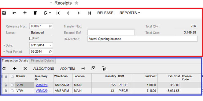
At presented screeshot red part presents summary, and blue part presents details. Also you can notice that details part can contain some tabs, but about them I'll mention later.
Now let's see other types of controls:
Selector
It can look like this:
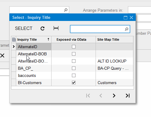
In selector Acumatica developer can customize columns that will be displayed. Also list in selector can be changable. In the presented screenshot we can change order of columns, names and content. As usually selectors are used for displaying data from some table in db. Also selectors can be in used in the grid. One more feature of selectors there are used for navigating between different records. On the screen AR301000 (Invoices and Memos) selector used for navigate between different invoices. Take note also that with selector you can search for needed record. One more feature that often is added to selectors is Autonumbering. It works according to the following scenario. Imagine that needs to create some new entity. In such case he opens needed form, and start to enter values for it. In the field for selector while record is not persisted in database it will be written <New>. And after persisitng to database <New> will be replaced with some generated value. Programmers can generate for you any numbering sequence that follow any kind of logic.
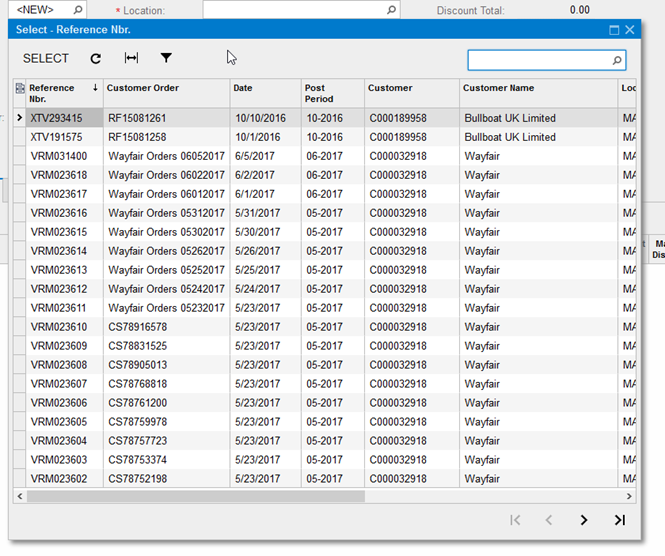
Take a look at screenshot of another selector:
DateTime
As name suggests you can use this kind of controls for entering date time values. It can look like this:
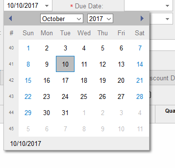
or like this:
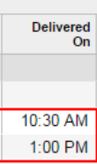
and for selecting time it can look like this:
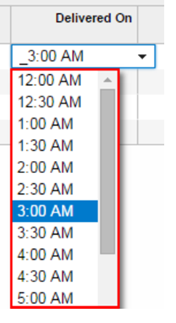
Dropdown list.
Some times there is a need to have fixed set of values in combo box. In html environment it is often named select.
Drop down list can look like this:
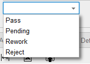
Currency input
For USA customers it is not very needed feature, but for out USA customers currency input is very useful control. It has two presentations:
![]()
and if you click on it you'll see following window:
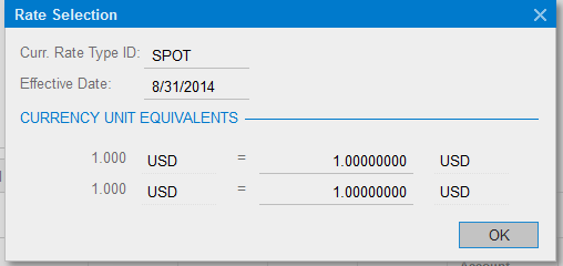
Presented screenshot have not many benefits because it has conversion between USD to USD, but for some international compaines it meant a lot. BTW, it is very simple to integrate Acumatica with any currency exchange providers. For example I've created integration with Ukrainian National bank or Belorussian National bank.
Textbox
Probably the most used and needed control. It can be displayed like this:
![]()
Also Acumatica allows to create some filtering for textbox. One of the examples is allow to enter into textbox only numbers. Additional detail. It is possible to program interaction between controls. Most common example display enter in one column some number, enter in another column percentage, press enter and third column show multiplication of first column on second column.
Tabs
In case if you have meny details parts, and don't want to create many screens you can use tabs. Tabs in Acumatica look like this:
![]()
Navigation and persistance buttons
Acumatica also has mechanism for navigating via records with navigation buttons. Navigation buttons look like this:

Besides navigation buttons at presented screenshot there are buttons Save, Cancel, Insert, Copy/Paste.
Customizing grid
Grid in Acumatica can have different sets of buttons. Below goes list of different standard options:
- Add, Delete, Fit to Screen, and Export buttons to the toolbar. This set is typically used for a grid on a simple edit page that consists of the single grid.
- Refresh, Add, Delete, Fit to Screen, and Export buttons to the toolbar. This set is typically used for a grid that displays the detail data on a master-detail page
- Refresh, Fit to Screen, and Export buttons to the toolbar. This set is typically used for grids on inquiry and processing pages
- Refresh and Fit to Screen buttons to the toolbar
- Without toolbar.
And some screenshots:
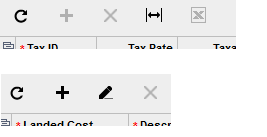
And also Acumatica allows to customize grid with your custom buttons and even with enabling/disabling them depending from condition.
Take a look at following screenshot:

At presented screenshot button Load Documents is enabled, and button View document is disabled.
Action buttons
Also you can add custom buttons to the top of page. Take a look at another screenshot:

with red rectangle I've highlighted button Release. It was added with some C# code.
Besides adding just buttons, Acumatica allows to add buttons with menu. It can look like this:
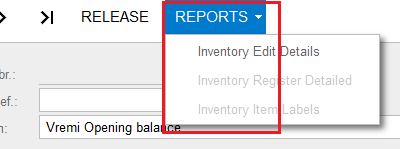
At presented screenshot fragment Reports is button, with three menu items: Invenotry Edit Details, Inventory Register Detailed, Inventory Item Labels.
Ready to take your Acumatica experience to the next level? Whether you need custom controls, advanced grid customizations, or seamless integrations with external systems, our team of Acumatica developers is here to bring your vision to life.
If you have a specific customization request or need tailored solutions to enhance your Acumatica platform, don’t hesitate to reach out. Leave us a detailed request today, and let’s transform your ideas into reality. Your perfect Acumatica solution is just a click away—let’s build it together!