Exploring Mobile Layout Elements in Acumatica 2026 R1
A Technical Whitepaper on SelectionList, ListView, and CaptionValueTable Customizations
With the release of Acumatica 2026 R1, mobile application developers have gained powerful new layout elements designed to improve readability, data structure, and interaction flows on mobile screens. Key among these enhancements are the SelectionList container type, the ListView layout, and the CaptionValueTable layout. This guide explores what these elements are, how they function, and provides a practical demonstration using a Sales Order details grid customization to show how they come together to deliver native-feeling, high-performance layouts on the go.
1. Deep Dive into the New Mobile Elements
A. SelectionList Container: The SelectionList container type enables multi-select modes for lists on mobile screens. When a container's type is set to SelectionList, the mobile framework automatically renders checkboxes next to each individual list item. This allows users to easily select multiple rows simultaneously, facilitating highly efficient batch operations (such as multi-line releases, approvals, or detail modifications).
B. ListView Layout: The ListView layout is a key structural building block used to define the layout structure of individual list cards. Instead of displaying a flat list of fields, the ListView acts as a parent container holding nested child components (such as rows, columns, or tables), granting developers absolute typographic and spatial control over individual records.
C. CaptionValueTable Layout: The CaptionValueTable layout represents a major visual enhancement in 2026 R1. It arranges fields in an aligned, table-like grid where field labels (captions) align perfectly on the left, corresponding values align on the right, and the empty middle space is dynamically bridged with clean dot leaders (e.g., Line Description .......... Acer Laptop). This visual pattern guarantees extreme readability for complex details on compact mobile devices.
2. Mobile Style Classes in Acumatica 2026 R1
To supplement these structural elements, Acumatica 2026 R1 includes explicit style classes that control field weights, sizes, and alignments on the screen. Developers apply these styles directly inside the field's properties via the style attribute:
|
Style Class |
Alignment / Emphasis |
Developer Usage Description |
|
importance-high |
High emphasis (Bold) |
Emphasizes critical keys like Inventory ID or Order Status in bold prominent text. |
|
importance-low |
Low emphasis (Gray) |
De-emphasizes secondary fields like line descriptions, displaying them in a lighter gray font. |
|
column-left |
Left-aligned (Default) |
Standard left-aligned field orientation. This is applied by default without explicit syntax. |
|
column-right |
Right-aligned |
Aligns values or labels to the far right. Ideal for numbers, prices, or secondary details inside rows. |
3. Demonstrative Example: Customizing a Mobile Details Grid
To demonstrate how these layouts operate in practice, let us look at a customization case study. We will modify the Details grid of the Sales Orders (SO301000) screen to replace the standard flat layout with a multi-select list that displays aligned inventory, description, and quantity fields.
|
update screen SO301000 { update container "Details" { Type = SelectionList update group "LineInventoryIdGroup" { remove field InventoryID remove field LineDescription } update layout "LineQuantityRow"{ remove field Quantity } add layout "listview" { displayName = "listview" layout = "ListView" add layout "table" { displayName = "table" layout = "CaptionValueTable" add field "InventoryID" { selectorDisplayFormat = Key style = "importance-high" } add field "LineDescription" { style = "importance-low column-right" } add field "Quantity"{ } } } } } |
Part-by-Part Customization Walkthrough:
• Step 1 (Target Container): Targeting the screen SO301000 and updating container Details with Type = SelectionList instantly enables checkbox selections on each row.
• Step 2 (Layout Cleanup): We remove the default InventoryID, LineDescription, and Quantity from their original layout groups to prevent layout duplicates before re-adding them.
• Step 3 (Parent ListView): add layout "listview" with layout = "ListView" sets up the parent visual envelope for the details line items card.
• Step 4 (Aligned Table): Nesting add layout "table" with layout = "CaptionValueTable" activates the aligned labels and values connected with dot leaders.
• Step 5 (Style Injection): Setting selectorDisplayFormat = Key and importance-high makes the InventoryID bold and clear. Applying importance-low column-right to the LineDescription pushes the detailed description to the right in gray, smaller font.
4. Visualizing the Custom Details Tab
To help visualize how these MSDL layout changes translate to the physical mobile user interface, below is the screenshot of the final version of the Details tab on the Sales Orders mobile screen displaying the aligned CaptionValueTable and SelectionList multi-selection elements:
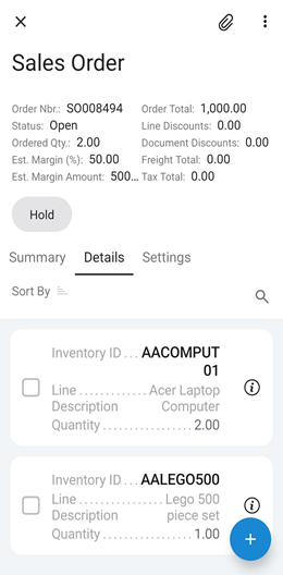
A. SelectionList Checkboxes
On the far left of each line card, empty checkable boxes are rendered, allowing users to perform quick multi-select batch actions.
B. CaptionValueTable dot leaders
Aligned dot leaders dynamically connect the left-aligned field labels to their values on the right, creating a clean visual line.
C. high importance (Bold)
The inventory ID (e.g., AACOMPUT01 and AALEGO500) uses the importance-high style class for clear identification.
D. low-importance (gray) & right-aligned
The item description displays on the far right using importance-low column-right, wrapping automatically to fit the space.
E. Floating Action Button (FAB)
The native circular plus + button at the bottom right permits users to rapidly add lines.
Conclusion
Acumatica 2026 R1's mobile layout engine gives developers the tools needed to design compact, high-density, and clean user interfaces. By using SelectionList to enable batch workflows, ListView to organize the card structure, and CaptionValueTable paired with style alignments like column-right and importance-high, you can transform complex line-item grids into clean, native-feeling, and scanning-optimized mobile screens.
Comments are provided by Disqus, which sets its own cookies, including for advertising.