Build In Data Sets In Sklearn
Hello everybody,
today I want to write a few words about built in data sets in sklearn library of python but from Visual Studio 2017 prospective. You may ask why Visual Studio 2017 if there are plenty of other options? I can say that main reason is becuase I like debugging features that availabile in Visual Studio which make my life much simpler.
Initial headers and one function
So, before we continue, we need as usually in Pythong import some basic libraries. You can do it in Visual studio like this:
import sklearn
from matplotlib import pylab
import matplotlib
import matplotlib.pyplot as pyplot
import numpy as np

from sklearn import datasets

def sanitize_sequence(data):
    return list(data)
Later you will see why funciton sanitize_sequence is needed.
Data generation
In python you can generate data with following functions:
- make_classification
- make_regression
- make_circles
- make_checkerboard
- and some others
I can't say why those names were chosen, because IMHO make_classification name is better used for something that can classify some data set, but authors of sklearn.dataset decided that it's good idea. So, leave it on their conscience and let's consider some examples of usage. I'd like to mention that those functions allow us to generate data pairs (x, y) which is convenient for drawing on charts.
datasets.make_circles
circles = datasets.make_circles()
This function allows us to generate data set that looks on plane as two circles with one circle inside the other. Consider following code and visualization for it:
circles = datasets.make_circles()

print ("features: {}".format(circles[0][:10]))
print( "target: {}".format(circles[1][:10]))

from matplotlib.colors import ListedColormap

colors = ListedColormap(['red', 'yellow'])

pyplot.figure(figsize=(8, 8))

pyplot.scatter(list(map( lambda x: x[0], circles[0])), list(map(lambda x: x[1], circles[0])) , c = circles[1], cmap = colors)

pyplot.show()
it will give you the following picture:
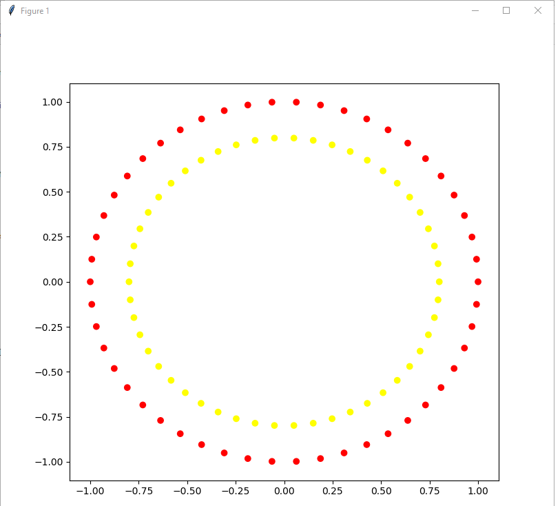
Method make circlies gives as output sequence (x, y) or in terms of python tuple that consists of two elements: list of (x,y) coordinates and list of target coordinates.
For the next step let's merge two functions: figure and scatter in one function in order to shorter recordings.
def plot_2d_dataset(data, colors):
    pyplot.figure(figsize(8,8))
    pyplot.scatter(list(map( lambda x: x[0], data[0])), list(map(lambda x: x[1], data[0])) , c = data[1], cmap = colors)
    pyplot.show()
Having this we can decide to make our life different and generate for ourselves data set with blured borders. Let's try this approach and visualize it with the folloiwng lines of code:
noisy_circles = datasets.make_circles(noise = 0.05)
plot_2d_dataset(noisy_circles, colors)
and you'll see following result:
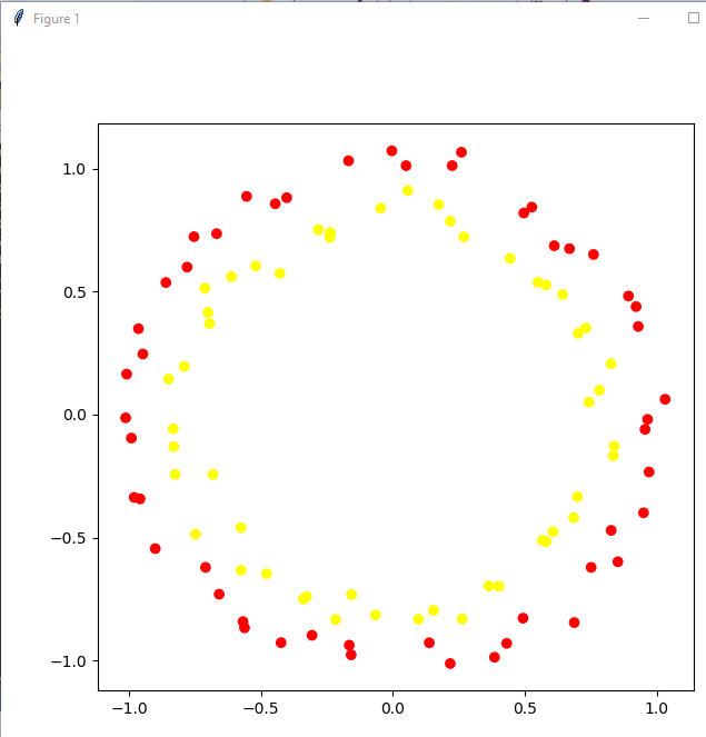
as you can see we can use this model for checking power of our model. But let's make model even more blurred:
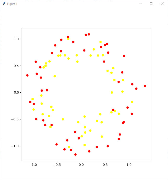
with such approach we can see that life for classification model become even more complicated.
Next let's consider function make_classification. Take a look at the code:
simple_classification_problem = datasets.make_classification(n_features = 2, n_informative = 1,
                                                             n_redundant = 1, n_clusters_per_class = 1, random_state = 1)
With this function we can flexibly generate problem, and we can say how many objects we want to get, quantity of features, which number of features should be informative, and which redundant, we can even add repetative features.
plot_2d_dataset(simple_classification_problem, colors)
Presented code sets numberf of features to 2, which gives us task of binary classification, with 1 informative feature, 1 redundant featue. Take a look how it looks like:
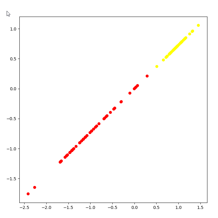
As you can see task is very simple, and it's trivial to figure out where to draw a separation line.
Now let's make life harder, and let's add classification for four classes:
classification_problem = datasets.make_classification(n_features = 2, n_informative = 2,
                                                      n_classes = 4, n_redundant = 0, n_clusters_per_class = 1, random_state = 1)
colors = ListedColormap(['red','blue','green','yellow'])
plot_2d_dataset(classification_problem, colors)
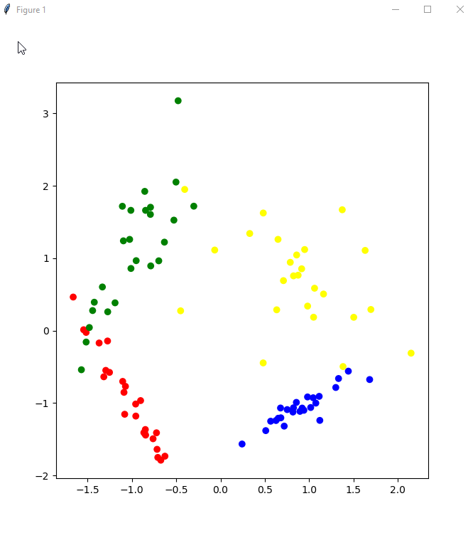
as you can see from picture we have four different classes of data. With this function you can generate data sets of any level of complexity without need of providing to others production data.
Toy examples
sklearn.datasets has also so called toy examples. You can load them with the following functions:
- load_irs
- load_boston
- load_diabetes
- load_digits
- load_linnerud
- etc
We can take a look how iris looks like:

iris = datasets.load_iris()
print(iris)
and here is screenshot of result:
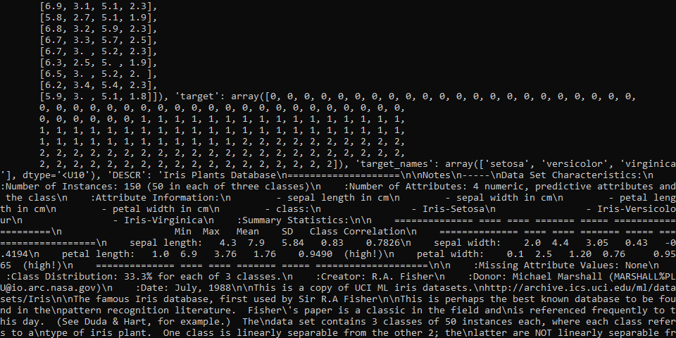
as you can see, it looks like iris is some kind of object like dict with some values.
Take a look on keys:
Snippet
print(iris.keys())
and screenshot:

Take a look at field DESCR.
I will leave up to you to see how output of DESCR look like, but I can say that it is quite detailed for watching.
Now take a look how data look like. With purpose of simplification of output we will print only first 10 values:
Snippet
print(iris.data[:10])
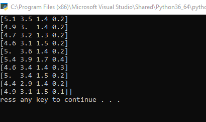
also take a look at target variable:
print(iris.target)
and here is another output but inside of Visual Studio:

so in case if you closed the window, you still will be able to see output.
Visualization of data
Convenience of visualization we will import DataFrame from pandas library. Also take a look at some visualizations. In Visual Studio it can be done like this:
from pandas import DataFrame

iris_frame = DataFrame(iris.data)
iris_frame.columns = iris.feature_names
iris_frame['target'] = iris.target


print(iris_frame.head())
In Visual Studio it will give you following visualization:
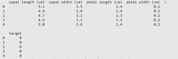
I can't say that I like it very much, be we have what we have. In any case, you can see inputs, and also targets for those inputs. If you want to change how the output look like, you can use the following:
from pandas import DataFrame
import pandas as pd
pd.set_option('display.max_columns', 0)
iris = datasets.load_iris()
iris_frame = DataFrame(iris.data)
iris_frame.columns = iris.feature_names
iris_frame['target'] = iris.target


print(iris_frame.head())
In that case you'll see the following picture:

IMHO it is more convenient to use then previous multiline view.
For now let's continue with analyzis and replace in column targets numbers with names. This can be done with function apply:
iris_frame.target = iris_frame.target.apply(lambda x: iris.target_names[x])
print(iris_frame.head())
take a look at results:
   sepal length (cm)  sepal width (cm)  petal length (cm)  petal width (cm)  target
0                5.1               3.5                1.4               0.2  setosa
1                4.9               3.0                1.4               0.2  setosa
2                4.7               3.2                1.3               0.2  setosa
3                4.6               3.1                1.5               0.2  setosa
4                5.0               3.6                1.4               0.2  setosa
Now you can see instead of 0 for target more convenient name like setosa.
Let's check how looks diagram of features for class setosa:
iris_frame[iris_frame.target == 'setosa'].hist('sepal length (cm)')
pyplot.show()
and below you can see result of this code:
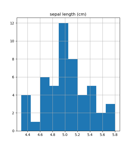
What it gives? Well, if you just want to see single distribution, you are done. But in reality it can be needed to analyze multiple distributions. Quite often I can say it is needed to see all features distribution in boundaries of all classes. How to achieve it? Such information will allow us to see are those features differnet, will it become possible to separate somehow those objects. One of the ways to achieve it can be via drawing each feature distribution at a time. But you'll agree that it is not very convenient. Imagine case when you have many features and many classes, that can be cumbersome task. So, what programmers as usually do in such cases? They write cycles. The same is possible in python.
Take a look at following continuation of code:
plotNumber = 0
for featureName in iris['feature_names']:
    for targetName in iris['target_names']:
        plotNumber +=1
        pyplot.subplot(4,3, plotNumber)
        pyplot.hist(iris_frame[iris_frame.target == targetName][featureName])
        pyplot.title(targetName)
        pyplot.ylabel(featureName[:-4])

pyplot.show()
It will give you the following output:
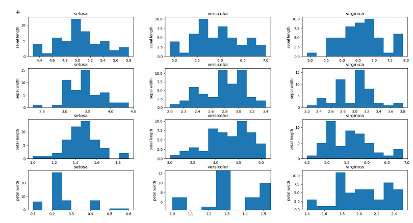
for this code I want to comment that method subplot allows us to construct matrix from charts. This method allows us to pass into it number of rows and columns which we want to use. And also each separated chart will require from us to set it's number. As you can see from the picture, we have in rows different features and at rows different classes.
After that you can do some kind of analytics. For example if to speak about analysis of last row, you can see that maximum value for setosa is 0.6, while minimum value for versicolor is 1.0 which gives you idea about linerar separability of those items.
Library seaborn
One more convenient library for visulalization in python is seaborn.
Take a look at presented code:
import seaborn as sns

sns.pairplot(iris_frame, hue='target')
pyplot.show()
Looks pretty straitforwared, and take a look at picture generated:
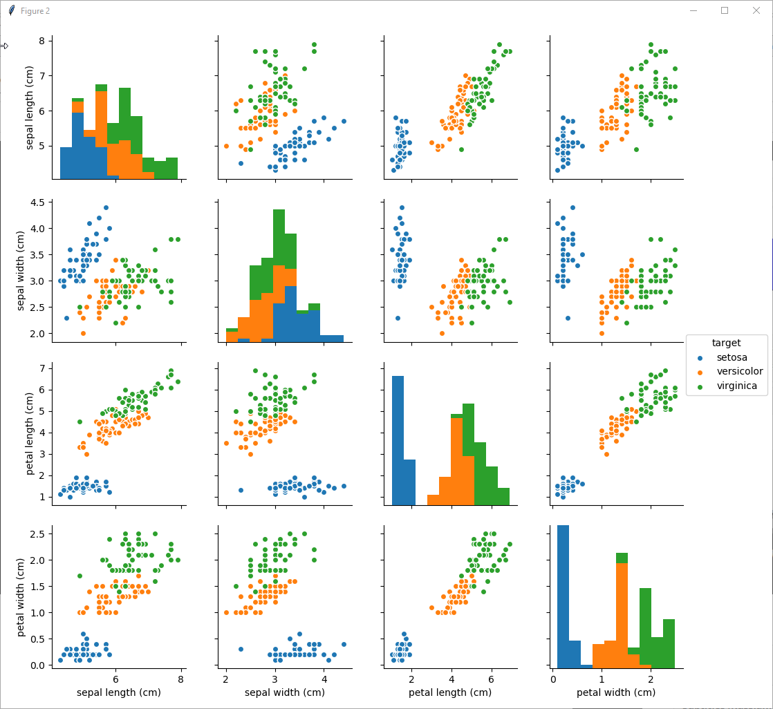
as you can see from the picture, the easiest for linear separation is setosa. Almost everywhere you can separate setosa from versicolor and virginica. But if to speak about separation between versicolor and virginica it will be relatively hard to separate them linearly, while possible with some error.
Some tricks related to Visual studio
For me it was a bit of challenge to find in Visual studio how to import some packages. Finally I have found that in order to import some package it is needed to make clicks as displayed at screenshots:
step 1:
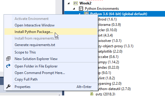
step 2:
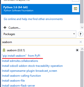
click on pip install seaborn from PyPI
Wait and you'll get seaborn library or any other.
Summary
I can say that to visualize any kind of data with Python, pandas and especially with seaborn is relatively easy. Also this approach allows you to quickly assume what kind of data you have, what kind of dependencies exist between them and how to separate them. Also you can easily visualize them.
Source code
If you want to follow source code by yourself in Visual studio by yourself, then here is the code:
import sklearn
from matplotlib import pylab
import matplotlib
import matplotlib.pyplot as pyplot
import numpy as np

from sklearn import datasets

def sanitize_sequence(data):
    return list(data)


circles = datasets.make_circles()

#print ("features: {}".format(circles[0][:10]))
#print( "target: {}".format(circles[1][:10]))

from matplotlib.colors import ListedColormap

colors = ListedColormap(['red', 'yellow'])

#pyplot.figure(figsize=(8, 8))
#pyplot.scatter(list(map( lambda x: x[0], circles[0])), list(map(lambda x: x[1], circles[0])) , c = circles[1], cmap = colors)
#pyplot.show()

thirdArg = circles[1]

def plot_2d_dataset(data, colors):
    pyplot.figure(figsize=(8,8))
    pyplot.scatter(list(map( lambda x: x[0], data[0])), list(map(lambda x: x[1], data[0])) , c = data[1], cmap = colors)
    pyplot.show(block = False)

noisy_circles = datasets.make_circles(noise = 0.05)
#plot_2d_dataset(noisy_circles, colors)

noisy_circles = datasets.make_circles(noise = 0.15)
#plot_2d_dataset(noisy_circles, colors)

simple_classification_problem = datasets.make_classification(n_features = 2, n_informative = 1,
                                                             n_redundant = 1, n_clusters_per_class = 1, random_state = 1)
#plot_2d_dataset(simple_classification_problem, colors)

classification_problem = datasets.make_classification(n_features = 2, n_informative = 2,
                                                      n_classes = 4, n_redundant = 0, n_clusters_per_class = 1, random_state = 1)
colors = ListedColormap(['red','blue','green','yellow'])
#plot_2d_dataset(classification_problem, colors)

iris = datasets.load_iris()
#print(iris)

#print(iris.keys())

#print (iris.DESCR)

#print(iris.data[:10])

#print(iris.target)


from pandas import DataFrame
import pandas as pd
pd.set_option('display.max_columns', 0)
iris = datasets.load_iris()
iris_frame = DataFrame(iris.data)
iris_frame.columns = iris.feature_names
iris_frame['target'] = iris.target

#print(iris_frame.head())
iris_frame.target = iris_frame.target.apply(lambda x: iris.target_names[x])
#print(iris_frame.head())

iris_frame[iris_frame.target == 'setosa'].hist('sepal length (cm)')
#pyplot.show()

def DrawFeaturesInCycle():
    plotNumber = 0
    for featureName in iris['feature_names']:
        for targetName in iris['target_names']:
            plotNumber +=1
            pyplot.subplot(4,3, plotNumber)
            pyplot.hist(iris_frame[iris_frame.target == targetName][featureName])
            pyplot.title(targetName)
            pyplot.ylabel(featureName[:-4])
    pyplot.show()
    return featureName, plotNumber

#featureName, plotNumber = DrawFeaturesInCycle()

import seaborn as sns

sns.pairplot(iris_frame, hue='target')
pyplot.show()
Looking to customize Acumatica to fit your specific business needs? Our expertise in Acumatica development ensures tailored solutions that enhance efficiency and streamline operations. Whether it's custom modules, integrations, or automation, we've got you covered.
Leave a request today, and let's bring your vision to life!